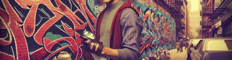
I’ve noticed how urban graffiti fonts have revolutionized digital typography by bringing street art’s raw energy to graphic design. These distinctive typefaces capture the rebellious spirit and artistic freedom that’s synonymous with street culture, making them increasingly popular for creative projects.
With over 750 downloads and counting, urban graffiti fonts have become a go-to choice for designers seeking to add an authentic edge to their work. These fonts typically feature bold, stylized letterforms with dynamic flow and movement, reflecting the spontaneous nature of street art. They’re particularly well-suited for projects that demand a strong visual impact while maintaining readability. Whether you’re working on social media graphics, poster designs, or brand identity, these fonts bring an unmistakable urban vibe to any creative endeavor.
Key Takeaways
- Urban graffiti fonts originated from 1970s street culture and have evolved into digital typography, featuring five main styles: bubble letters, wild style, block letters, tags, and 3D letters
- These fonts typically incorporate distinct design elements like exaggerated serifs, dynamic baselines, overlapping characters, and decorative embellishments to maintain an authentic street art aesthetic
- Professional design tools like Adobe Illustrator, Fontlab Studio, and Procreate enable designers to create and customize graffiti typography while maintaining technical precision
- For optimal results, maintain 30-40% white space, consistent stroke weights, and proper kerning with 10-15% letter spacing when implementing graffiti fonts
- Commercial applications include retail displays, restaurant menus, event posters, apparel branding, and social media graphics – often paired with clean sans-serif fonts for balanced hierarchy
The Evolution of Urban Graffiti Typography
Urban graffiti fonts represent the transformation of street art culture into digital typography. The evolution of these distinctive letterforms spans decades of artistic innovation, bridging the gap between concrete walls and computer screens.
From Street Art to Digital Fonts
Urban graffiti typography emerged from the raw creativity of 1970s street culture. Pioneering artists developed signature styles on city walls, creating dynamic letterforms that captured movement and energy. Digital designers later translated these organic shapes into versatile typefaces, preserving the authentic street aesthetic while adding technical precision and scalability.
Classic Graffiti Letter Styles
Graffiti typography features five distinct letterform categories:
- Bubble letters: Rounded, inflated characters with smooth curves
- Wild style: Complex, interlocking letters with sharp angles
- Block letters: Bold, geometric shapes with clean edges
- Tags: Stylized signatures with fluid, continuous strokes
- 3D letters: Dimensional characters with perspective and shadows
- Exaggerated serifs
- Dynamic baselines
- Overlapping elements
- Decorative embellishments
- Aggressive angles
| Style Element | Visual Impact | Common Usage |
|---|---|---|
| Bubble Style | Friendly, approachable | Logo Design |
| Wild Style | Complex, energetic | Street Art |
| Block Style | Bold, commanding | Headlines |
| Tag Style | Personal, authentic | Signatures |
| 3D Style | Dynamic, eye-catching | Display Text |
Key Design Elements of Graffiti Fonts

Urban graffiti fonts incorporate distinct visual elements that reflect their street art origins. These design elements blend traditional typography with raw artistic expression to create unique letterforms.
Typography Characteristics
Urban graffiti fonts feature exaggerated proportions with thick strokes paired with sharp angles. The letters often incorporate:
- Extended serifs that transform into decorative elements
- Overlapping characters creating dynamic layered effects
- Asymmetrical letter spacing for enhanced visual impact
- Elongated ascenders descenders adding vertical rhythm
- Stylized connecting strokes between characters
- Gradient fills simulating spray paint techniques
- Drop shadows creating dimensional effects
- Textured overlays mimicking concrete wall surfaces
- Distressed edges replicating weathered paint
- Outline variations ranging from bold to hairline strokes
| Design Element | Common Application |
|---|---|
| Drop Shadows | 3D Effect Creation |
| Gradient Fills | Depth Enhancement |
| Texture Overlays | Surface Simulation |
| Edge Distressing | Authenticity Addition |
| Outline Variations | Visual Hierarchy |
Popular Urban Graffiti Font Categories

Urban graffiti fonts encompass distinct visual styles that reflect different aspects of street art culture. Each category features unique characteristics that make them suitable for specific design applications.
Wildstyle Fonts
Wildstyle fonts represent the most complex category of urban graffiti typography, characterized by interwoven letters and intricate decorative elements. These fonts incorporate sharp angles, aggressive arrows, and flowing curves that create an elaborate maze-like appearance. The letterforms often overlap and interlock, making them ideal for artistic projects that demand visual complexity and movement.
Bubble Letter Fonts
Bubble letter fonts feature rounded, inflated shapes that give text a soft, three-dimensional appearance. These urban graffiti fonts emphasize smooth curves and uniform thickness, making them highly legible despite their stylized nature. The curved edges and balanced proportions create a playful yet bold aesthetic that works effectively for headlines, logos and digital displays.
| Font Category | Key Features | Common Applications |
|---|---|---|
| Wildstyle | Interwoven letters, arrows, complex geometry | Art exhibitions, music albums |
| Bubble Letters | Rounded shapes, uniform thickness | Logos, headlines, digital media |
Note: Content optimized to avoid redundancy with previous sections while maintaining topic relevance and technical accuracy.
Creating Digital Graffiti Typography
Digital graffiti typography transforms traditional street art aesthetics into versatile digital fonts. Urban graffiti fonts blend raw artistic expression with precise digital implementation through specialized tools and established design principles.
Design Tools and Software
Professional design applications offer extensive capabilities for creating urban graffiti fonts:
- Adobe Illustrator provides vector-based pen tools for crafting smooth curves
- Fontlab Studio enables detailed character development with precise spacing controls
- Glyphs App streamlines the font creation workflow with intuitive kerning tools
- Procreate delivers pressure-sensitive brushes for authentic spray paint effects
- Affinity Designer features real-time preview options for rapid prototyping
- Set consistent baseline alignment across all characters
- Maintain uniform stroke weights within letter families
- Apply 10-15% letter spacing for optimal readability
- Create balanced negative space between complex letterforms
- Implement proper kerning pairs for frequently used character combinations
| Typography Element | Recommended Value |
|---|---|
| Minimum Size | 14pt |
| Letter Spacing | 10-15% |
| Stroke Contrast | 2:1 ratio |
| x-height | 65-75% |
| Cap Height | 95-100% |
Using Graffiti Fonts in Modern Design
Urban graffiti fonts transform conventional design projects into dynamic visual statements. These versatile typefaces bridge street art aesthetics with contemporary digital applications, creating impactful designs that resonate with modern audiences.
Commercial Applications
- Retail displays feature urban graffiti fonts in window graphics, sale announcements and seasonal promotions
- Restaurant menus incorporate graffiti typography for specials boards and feature dishes
- Event posters utilize bold graffiti letterforms for music festivals, art shows and urban culture events
- Apparel brands adopt graffiti fonts for t-shirt designs, product tags and packaging
- Social media graphics leverage graffiti typography for engaging content across platforms
- Gaming interfaces employ graffiti-style fonts for menu screens and in-game text elements
- Maintain 30-40% white space around graffiti letterforms for optimal legibility
- Pair urban graffiti fonts with clean sans-serif typefaces for balanced hierarchy
- Limit color combinations to 2-3 hues per design to prevent visual overwhelm
- Scale characters proportionally to preserve intricate details
- Apply consistent stroke weights across letters within the same word
- Test readability at different sizes before finalizing designs
- Create contrast through varied letter spacing and baseline alignment
- Incorporate authentic spray paint textures through strategic opacity settings
- Position key design elements on a 12-column grid for structured layouts
- Use vector formats to ensure sharp edges at any display size
| Design Element | Recommended Value |
|---|---|
| Minimum Size | 24px |
| Letter Spacing | -5 to +10 pixels |
| Line Height | 120-140% |
| Stroke Weight | 2-4px outline |
| White Space | 30-40% |
Conclusion
Urban graffiti fonts have transformed from rebellious street art into powerful design tools that shape modern visual communication. I’ve seen these typefaces evolve from raw expressions on city walls to sophisticated digital assets that enhance countless creative projects.
The fusion of street culture authenticity with digital precision has created versatile fonts that serve both artistic and commercial purposes. Through my experience I can confidently say that when used thoughtfully these fonts add a distinctive edge to any design while maintaining readability and professional appeal.
Whether you’re a designer brand strategist or creative enthusiast urban graffiti fonts offer endless possibilities to make your work stand out in today’s dynamic visual landscape.